While Creating means living; UX case study for 3Advance:
ABOUT 3ADVANCE:
As they have written in their website, 3Advance is a tight-knit development team that creates mobile apps and data-management applications. They work with both startup founders and business leaders that want to make change in their ecosystem. 3Advance offers an on-demand, elite team of professionals that develop user-focused apps at a fraction of the cost of a dedicated internal team.
Individual Project
Project Duration:
2 Weeks
Mission:
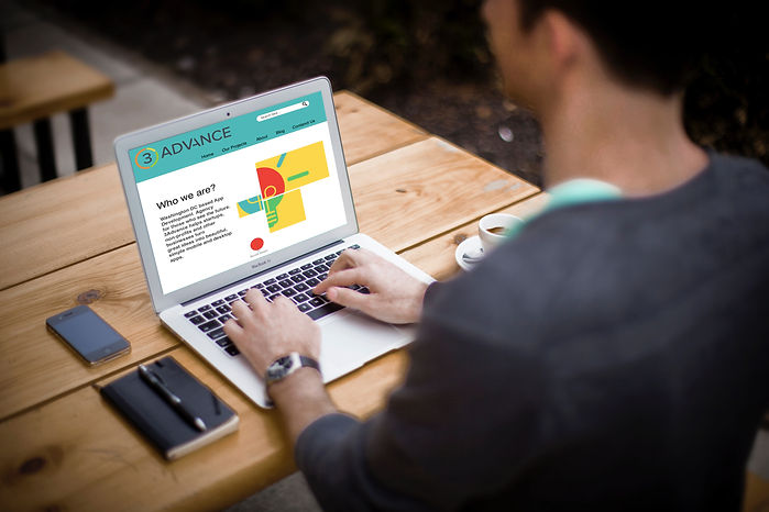
We were tasked to create a landing page for 3Advance company. They want to recreate their landing page to increase the numbers of site visitors, build their own brand and turn potential users into customers.
What is a landing page:
Based on Wikipedia description in online marketing, a landing page, sometimes known as a “lead capture page” or a “lander”, or a “destination page”, is a single web page that appears in response to clicking on a search engine optimized search result or an online advertisement. The landing page will usually display directed sales copy that is a logical extension of the advertisement, search result or link. Landing pages are used for lead generation. The actions that a visitor takes on a landing page is what determines an advertiser’s conversion rate.
A landing page is a website page that allows you to capture a visitor’s information through a lead form.
A good landing page will be targeted to a particular stream of traffic — say from an email campaign advertising a particular white paper — and, because it is targeted, and because it has an interesting offer behind a lead capture form, you will convert a higher percentage of your website visitors into leads with which you can follow up.
Solution:
Creating a landing page that view their company value proposition. Compete with their competitors. Talks about their objectives and bring customers with its simplicity. Their CEO emphasized about call to action keys.
To scale your business, you need a replicable process for acquiring new customers.
User Research:
Although their current website speaks up about their specialty and what they are doing in their company, in my user research I realized it is a little overwhelming for users. So I asked my friend to check their website and talk through what she sees and what she understands by checking their site. It took her a while to find out they are development company. They had good elements in their website, quote, pictures and description for each part. So what was missing? What makes it confusing?
Competitive research:
I started checking different landing pages. First I limited myself to local competitors, I wanted to see what makes them successful? then I decided to look broader. Why? because as long as you caught the attention, does it really matter where you are located?
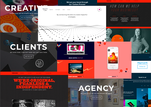
Screen Shots I Took From Successful Landing Pages
The key points from my competitive researches:
-
They mostly used eye-catching colors on their pages.
-
They used big titles
-
They have the short description for each part of their job they are doing
-
They introduced who they are and explained their mission on their first page.
-
They introduced their customers and put their customers quote in landing page
-
They used animation for their website, to make it eye-catching. There was some repeated elements and theme in all those pages.
-
They introduced their team in their first page to look more professional and show their experiences
I tried to use all these understanding I gained during user research, in my design. I created a website that is eye-catching with colors. I used some colors similar to their logo scheme.
Themes are the central focus of the story or narrative. Themes express the intended lesson, conclusion, message, or point of view of the author. Themes connect all the parts of the story such as characters, plot, the problem (conflict), setting, and event(s). A theme keeps the writer on point.
I added a light bulb as a theme for my design. The light bulb is the symbol of invention and sometimes of intelligence. It is also a symbol of light and connections.
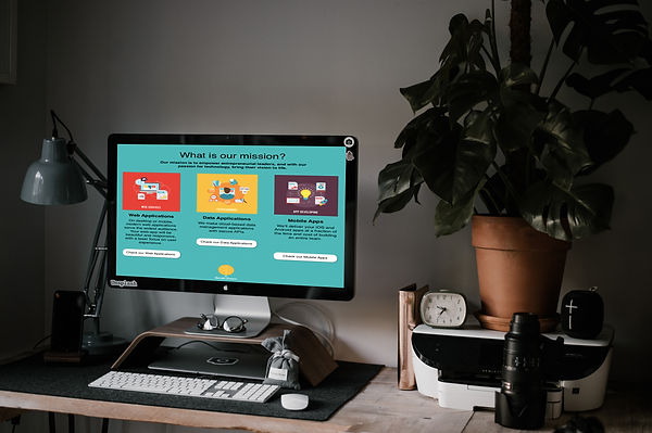
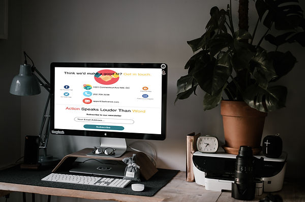
I increased the number of call to action buttons. Users will have several options to contact 3Advance and work with them. They have the option to check their works, their case studies and customers ideas about them in the main page.
Words that urge the reader, listener, or viewer of a sales promotion message to take an immediate action, such as “Write Now,” “Call Now,” or (on the Internet) “Click Here.” A retail advertisement or commercial without a call-to-action is considered incomplete and ineffective.
Final User Testing:
After finishing my design I double checked it with my friend. The one I asked before to check their actual website. I wanted to see if she was interested to look at my design, mostly because of the colors and icons I used. Honestly, I was more scared if she will not make connections with it. But I was lucky enough because she approved it is easy to locate everything on the website now.
I had this opportunity to share my design with my colleagues too. They all commented on my mockup. It was unbelievably helpful. I changed a few details. They were right, sometimes the illustrations I used was unnecessary. In some places, my font was exaggerated, and not to mention that I had one misspelled word too!
I re-polished my work again after this meeting. and corrected everything.
By the end, I need to say that, I am still new in this field, but nothing changes the joy of creating something. Of course, I still need to learn a lot, and sometimes I struggle during the process, but I am proud to learn from my failures. Thanks to 3Advance, I learn something new and feel that joy again.