In Honor Of Food; A UX Case Study For StreamChef

About StreamChef:
StreamChef is all about on-demand cooking classes with real chefs. Formerly HappyChef, the startup built to connect real chefs with a community of hungry, aspiring culinarians. By providing a resource hub of recipes and tutorials, in addition to its regular classes, StreamChef is looking to add Value to a market that continues to grow but still hasn’t fed the need of many consumers looking to grow their skills.
My Role:
Visual design lead
Project Duration:
3 Weeks
Our mission:
Designing a website for Stream Chef
Problem:
In modern life people are too busy to cook for their own. They often don’t want to make long, complicated and expensive meals. The following factors are the reasons for difficulties:
-
Time (grocery shopping, prepping food, cleaning up)
-
Budget
-
Not confident with their cooking skills
Solution:
A platform that gives access to people who want to cook great meals in a certain amount of time and for a certain cost.
Our teamwork:
As any other teamwork, we break our goal to smaller pieces and work on each piece step by step. We had scrum meetings every day and discussed our journey together. It was an experience for all of us, so we were together working on every task. However all of decided to focus more on some parts. My role? Yeah, I was happy to be the visual design lead.
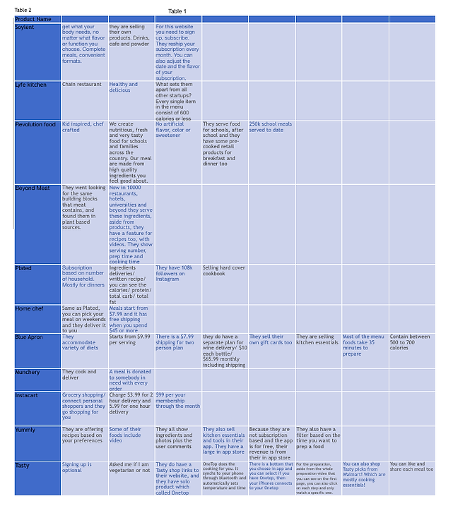
Market and competitive research:
We checked companies that provide videos or recipes to make the at-home cooking process more efficient. We also researched on the subscription based. We wanted to know why people like or dislike using these services. Our main competitors: Taste-made, Panna, all Recipes, Tasting Kitchen and Masterclass.
After our research, we realized we are working in a saturated market. So we need to know our users better. How did we understand their needs better? By the following step.
Competitive Research
User Research:
We used the screening survey to start our user research. We focused on cooking habits, time, shopping and ingredients. 168 people did our screener test through social media. 11 out of 28 people responded to our questionnaire. Our key take aways was that people want quick meals (30–45min), convenient meals (minimal prep) with fresh ingredients and low cost. Or as they said: “Quality of Whole Foods, for the cost of Walmart”
Who are our users:
Someone with limited time to prep and cook meals, but wants an inexpensive and healthy recipe that can be made at home.

Customer Journey Map
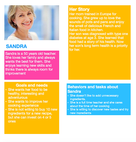
User Persona
We used Agile methodology, user and competitive research to make MVP that can solve the pain points of the users.
Features:
Our features were simple and convenient. We scrummed a lot to decide which features are good, which features doesn’t really meet our goal for this website, and which could be the future consideration. We wanted to have online classes from top local chefs two times per week. Our website gonna be subscription based but if our users decide not to subscribe they still have limited access to the recipes. Customers can ask their question directly from our chefs during and after video and the chefs will answer them. Ability to have a free one month trial is another good idea that we included in our website. This case user can use the website for a good amount of time and then decide if they want to purchase the subscription.
Visual Design Process:
We started our design process with pen and paper first we decided on our features. Then started our prototyping in Axure. We wanted to use animations to make our prototype interactive. We all did different prototypes and did the user testing afterward. We picked each feature and interaction that was making more sense for our users after the test. By putting all those parts from different prototypes together we finally created our main prototype. Then we did user testing again, to see if the user is still comfortable using it.
Our Sketch comes after Axure. If you create soul by research and body with the prototype, we can call Sketching the face of our website.

Part of StreamChef’s first page
The food is mostly colorful on its own. Full of details. We wanted to have a white background to allow our picture and videos to be seen. But we knew we want to include another color too. Green was our second color option, the color of nature. Classy and a reminder for the healthy foods. We tested everything before during Axure so we kept everything the same. Only added some details to it. Do you want to bookmark this video? Wanna see how many people have seen it? How many liked it? Come to join us at StreamChef.
This project was a great experience for me and my team. We enjoyed every second of it, and we are sure our users will be pleased by using it too.
